Snap Slider
A free responsive WordPress slider plugin to display images in a basic slider or a carousel with custom options and free support.
Plugin Layout
The free responsive WordPress slider plugin comes with two layouts.
-
Basic Slider
A simple basic slider display with controls to slide left and right along with a pager. Custom options included to change positioning and colors.
-
Carousel Layout
A carousel layout showing a static number of images which can be set from the dashboard. Fully responsive on all devices with any number of elements.
Plugin Features
- Ability to display slider with a shortcode anywhere.
- Custom options for each slider.
- Easily add, upload or delete images from the slider.
- Basic slider comes with 3 custom animations.
- Vertical and Fade transitions enabled.
- Enable/Disable auto slide.
- Display or hide the pager.
- Option to display or hide the previous/next controls.
- Position the pager wherever you want.
- Change colors of the pager bullets.
- Numbered pager bullets included
- Change background and color of control arrows.
- Opacity supported for colors of arrows.
- 100% responsive on all devices
Plugin Documentation
Free responsive WordPress slider plugin documentation
Installation
- Automatic - Download the plugin file by clicking here. Login to your WordPress dashboard. Go to Plugins > Add New, click on "Upload Plugin" at the top, browse the plugin zip file which you downloaded. Upload and Activate the plugin.
- Manual - Click here to download the plugin. Unzip the file and upload the folder crispslider to /wp-content/plugins/. Login to your admin dashboard, go to Plugins, find the plugin name "Crisp Slider", click on Activate.
Plugin Settings
Slider Type
- Basic/Carousel - Choose between basic slider or a carousel. Basic slider will display one image per slide. Carousel can display minimum of 2 images and maximum of 4 images per slide.
Slider Settings
- Slider Width - Specify the width of the slider. Accepted values can be in pixels or percentage. For example if you want the slider to be 500px wide, then enter 500px and if you want it to be 80% of the screen, then enter 80%.
- Mode - Choose between horizontal, vertical and fade transitions. Horizontal mode will slide the images right to left. Vertical mode will slide the images bottom to top while Fade will enable the fade effect between the slider images.
- Elements per slide (only for carousel) - Select how many images should show per slide in a carousel. Minimum is 2 and maximum is 4.
- Spacing (only for carousel) - Specify the spacing between the images in a carousel. Default is 30px.
- Auto - Enable or disable the auto transition of the slides.
- Controls - Enable or disable the previous and next controls of the slider.
- Transition Speed - Specify the custom transition speed of the slider transitions in miliseconds. Default speed is 800.
Pager Settings
(only for basic slider)
- Style - Choose between solid or numbered bullets. Solid will display a solid color like the usual bullets while numbered will display slide numbers.
Solid Bullet Settings
- Bullet Color - The default bullet color of the slider.
- Active Bullet Color - The active bullet color and the hover color.
Numbered Bullet Settings
- Background - The background color of the bullet.
- Text Color - The color of the bullet numbers.
- Active/Hover Background - The background color of the active bullet and the hover.
- Active/Hover Text Color - The color of the active bullet number as well as the hovered bullet.
- Bullet Type - Choose how you want the pager bullets to appear. Rounded will display them in a circle, while Square will display them as boxes.
- Bullet Position - Display the bullets either on top of the images or outside the image slider.
- Horizontal Position - Option to display the bullets either to the left, center or right.
- Vertical Position (only when bullet is inside) - Option to display the images on top or bottom of the slides.
Control Settings
- Background Type - Enable solid or transparent backgrounds of the control arrows.
- Background Color - Change the background color of the control arrows.
- Background Opacity (only when background is transparent) - Set the opacity of the arrow backgrounds.
- Arrow Color - Change the arrow color of the previous and next controls.
Plugin Demo
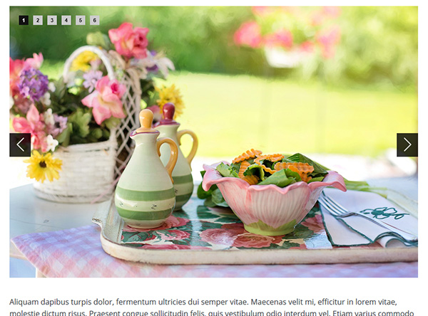
Basic Slider - Default


Basic Carousel


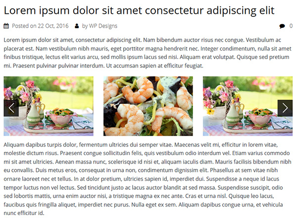
Basic Slider with Numbered Pager